Foundations
Released: Feb 6, 2025
From daily summaries to sleep and cardio reports, the app transforms raw health metrics into clear, actionable guidance that adapts to each user.
In progress
Liquid Glass
Estimated: September 2025
FitWoody embraces Liquid Glass, Apple's design standard that brings fluid, translucent interfaces to life.
In progress
2.0
Estimated: September 2025
The Next Evolution: FitWoody 2.0 represents a complete reimagining of personalized wellness technology.
In progress
Liquid Glass Redesign. FitWoody 2.0
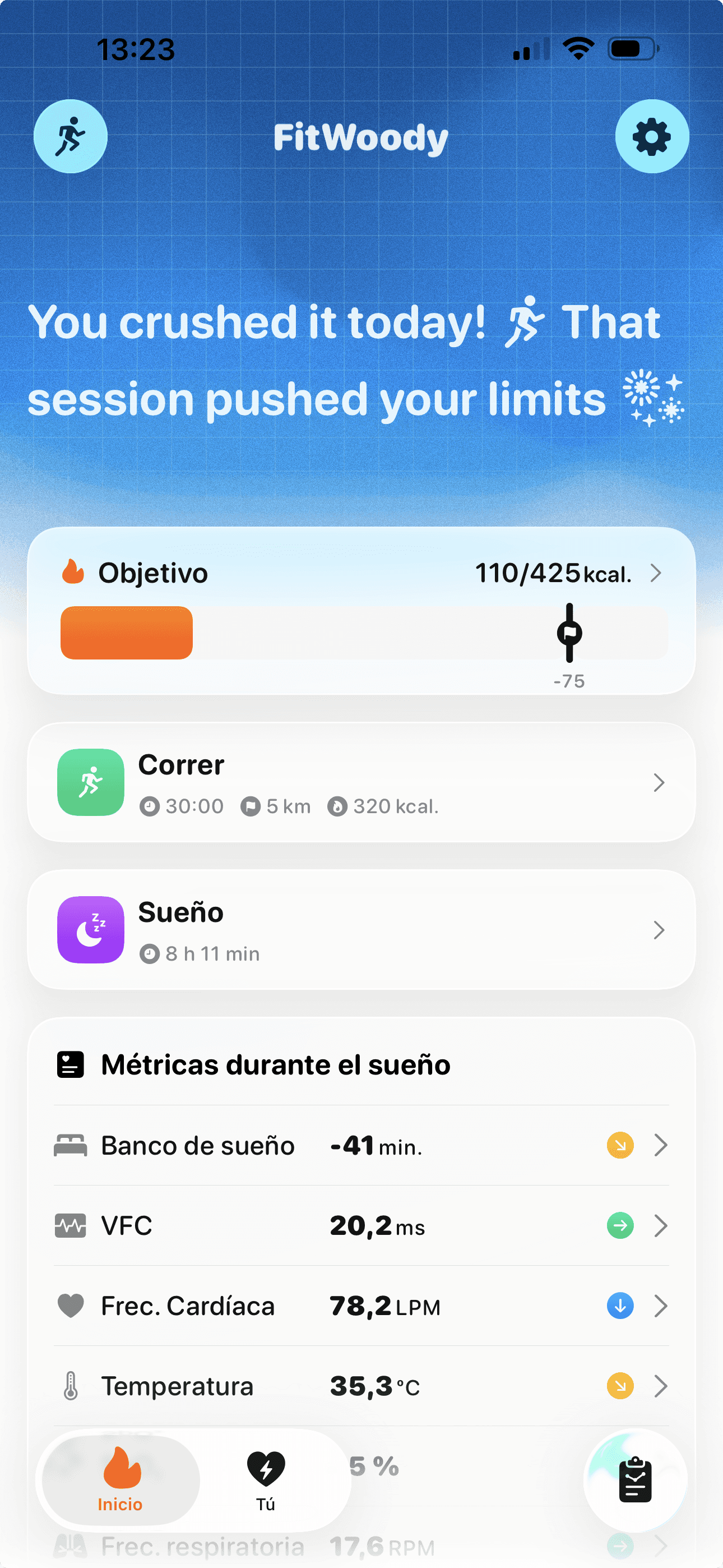
FitWoody 2.0 embraces iOS 26’s new Liquid Glass design language. Surfaces now feel lighter, translucent, and adaptive, creating depth while keeping the focus on your health data. Sheets, navigation, and cards all use tinted glass with soft transitions, making the app warmer and easier to read at a glance.
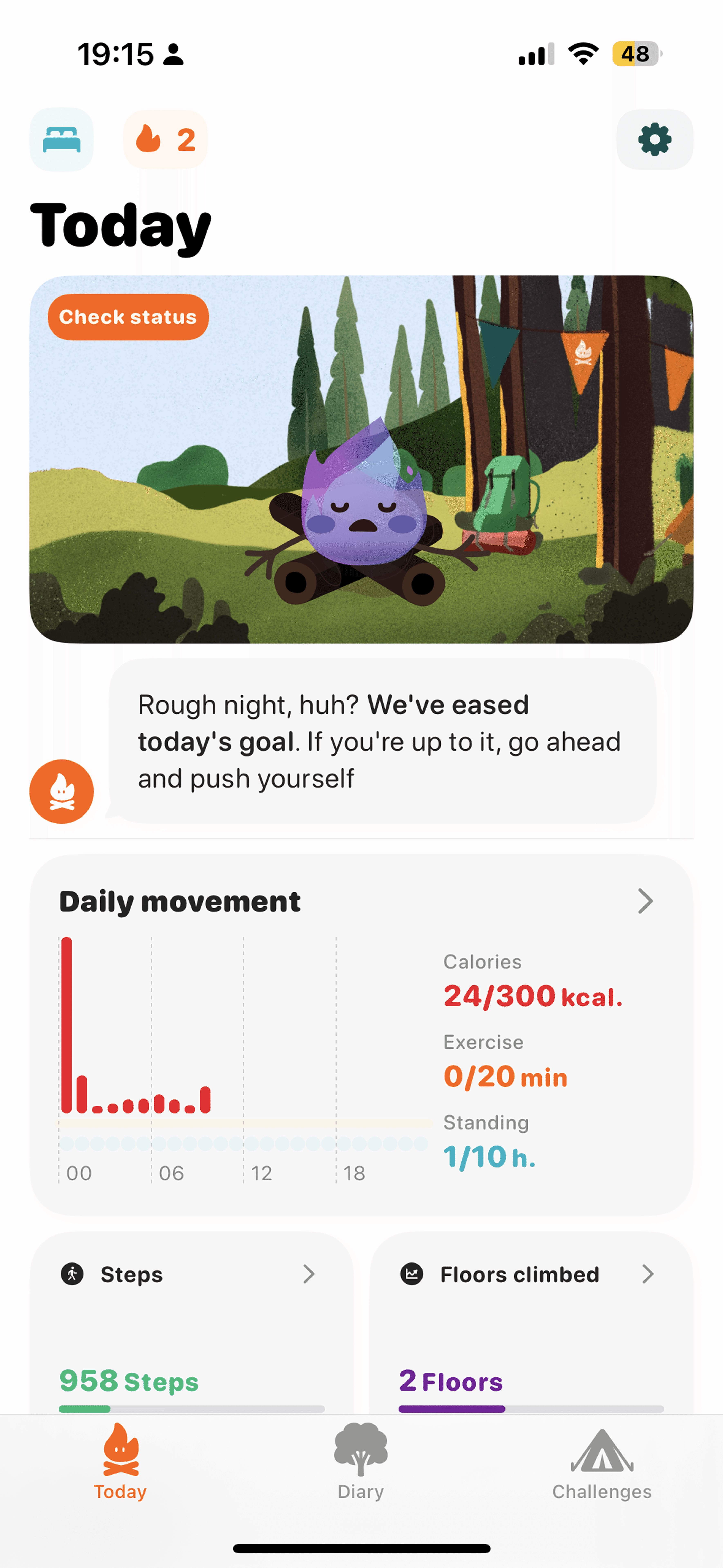

Before
The tab bar used a flat design with static sections and no adaptation to scrolling. Navigation felt heavier, with multiple steps to access key metrics.



After
The new tab bar minimizes on scroll, adds a dedicated search tab, and uses Liquid Glass effects. Navigation is faster and lighter, keeping the focus on your health data while reducing visual clutter.

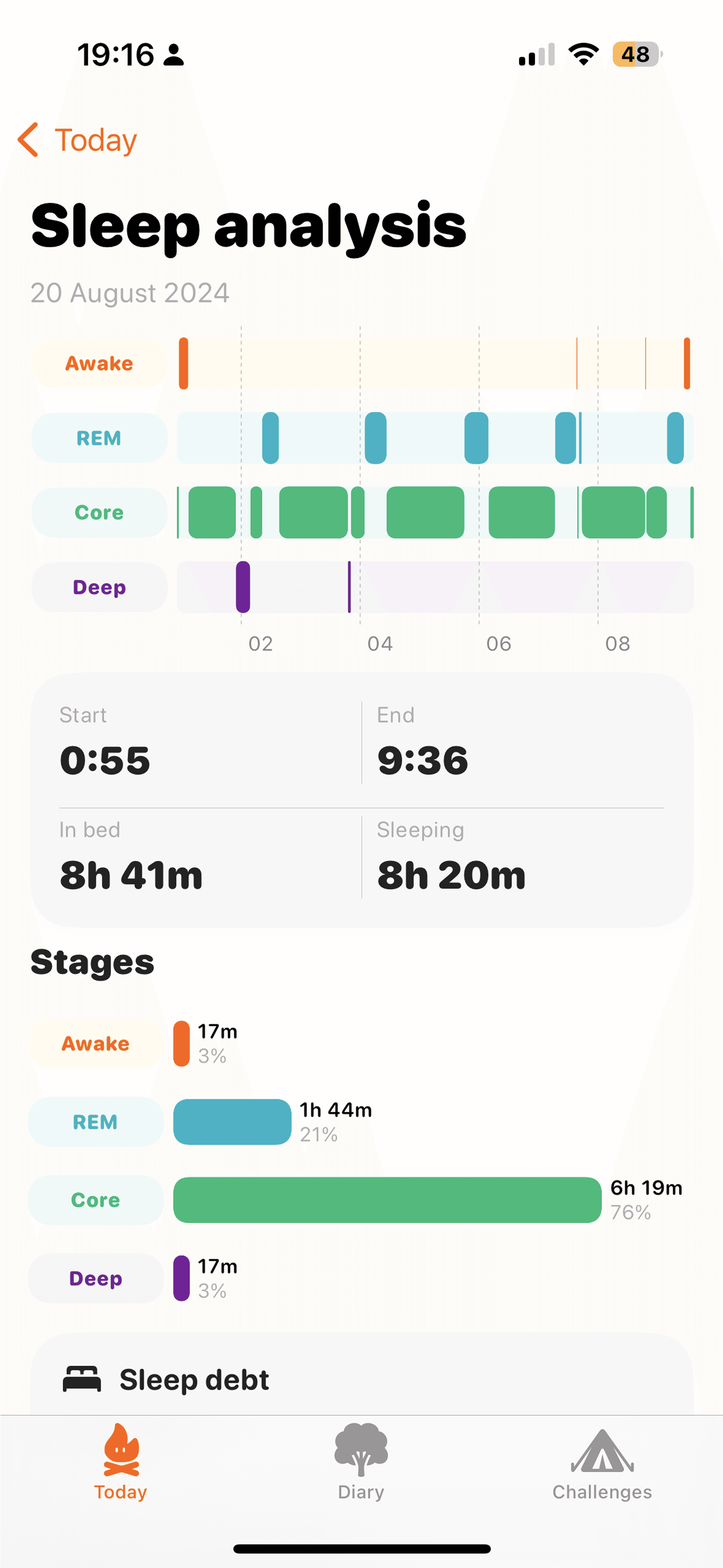


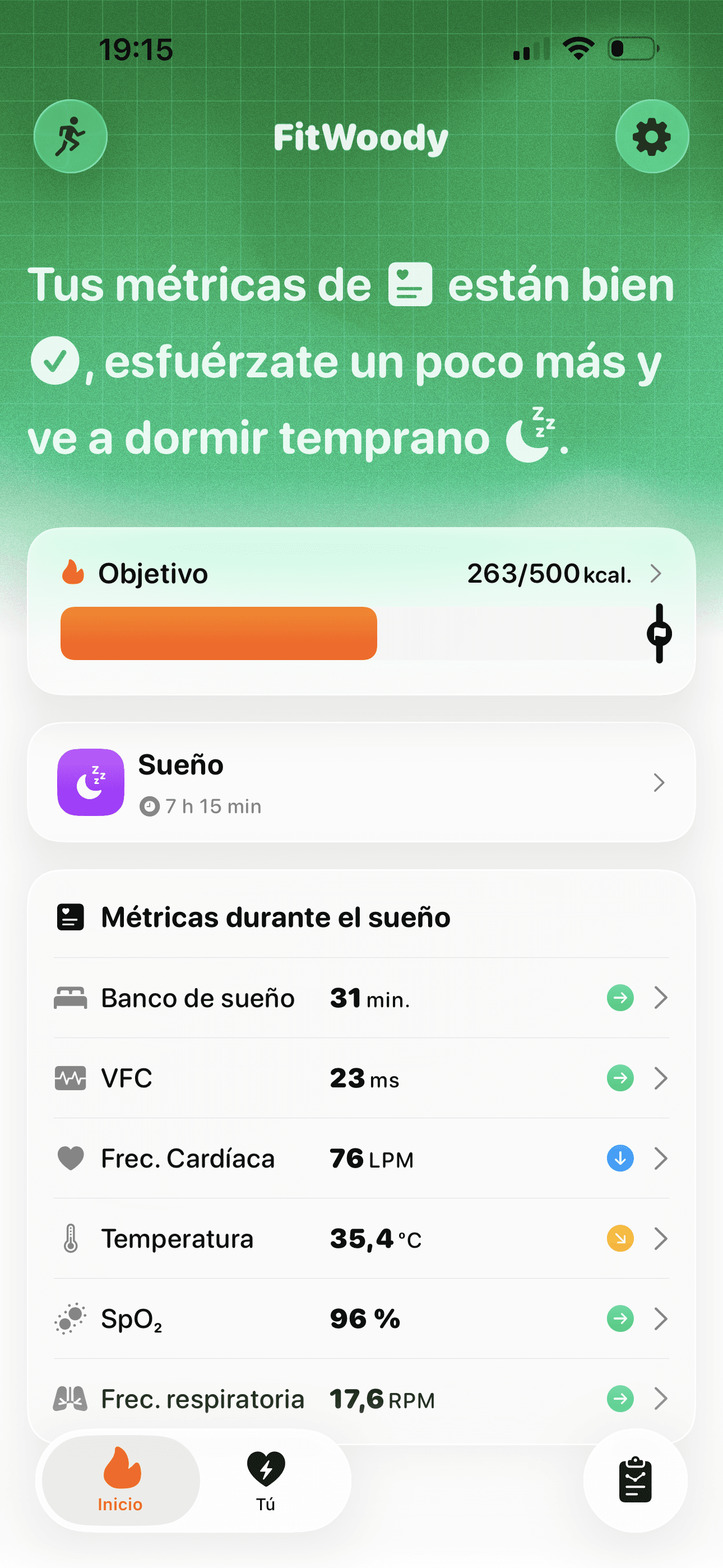
Before
Sleep stages were displayed in a flat view with limited context. Data was accurate but felt disconnected, making it harder to understand recovery quality at a glance.




After
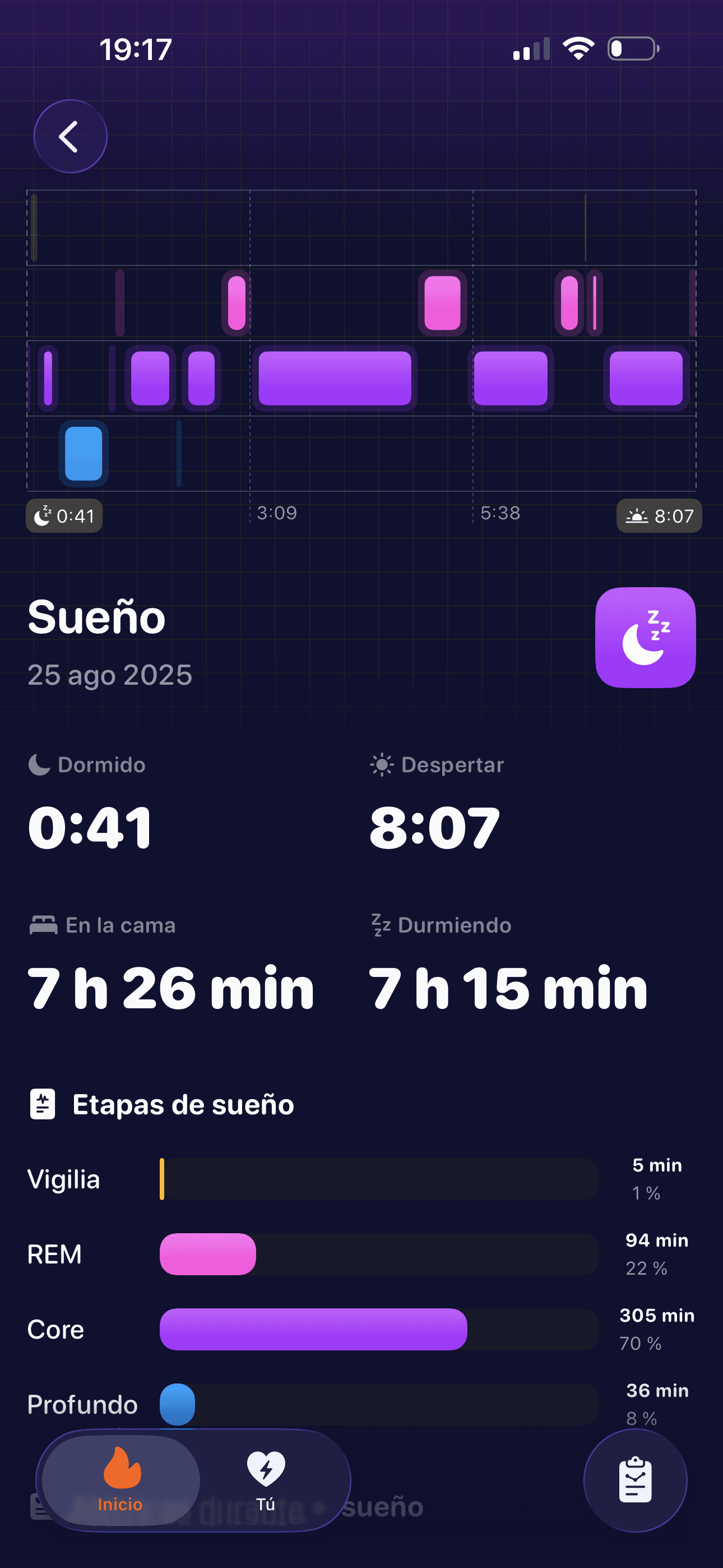
A darker Liquid Glass design that highlights each sleep stage with clear contrasts and a timeline view. The redesigned layout emphasizes recovery quality and links sleep directly to daily readiness, making the data easier to interpret and more actionable.




Before
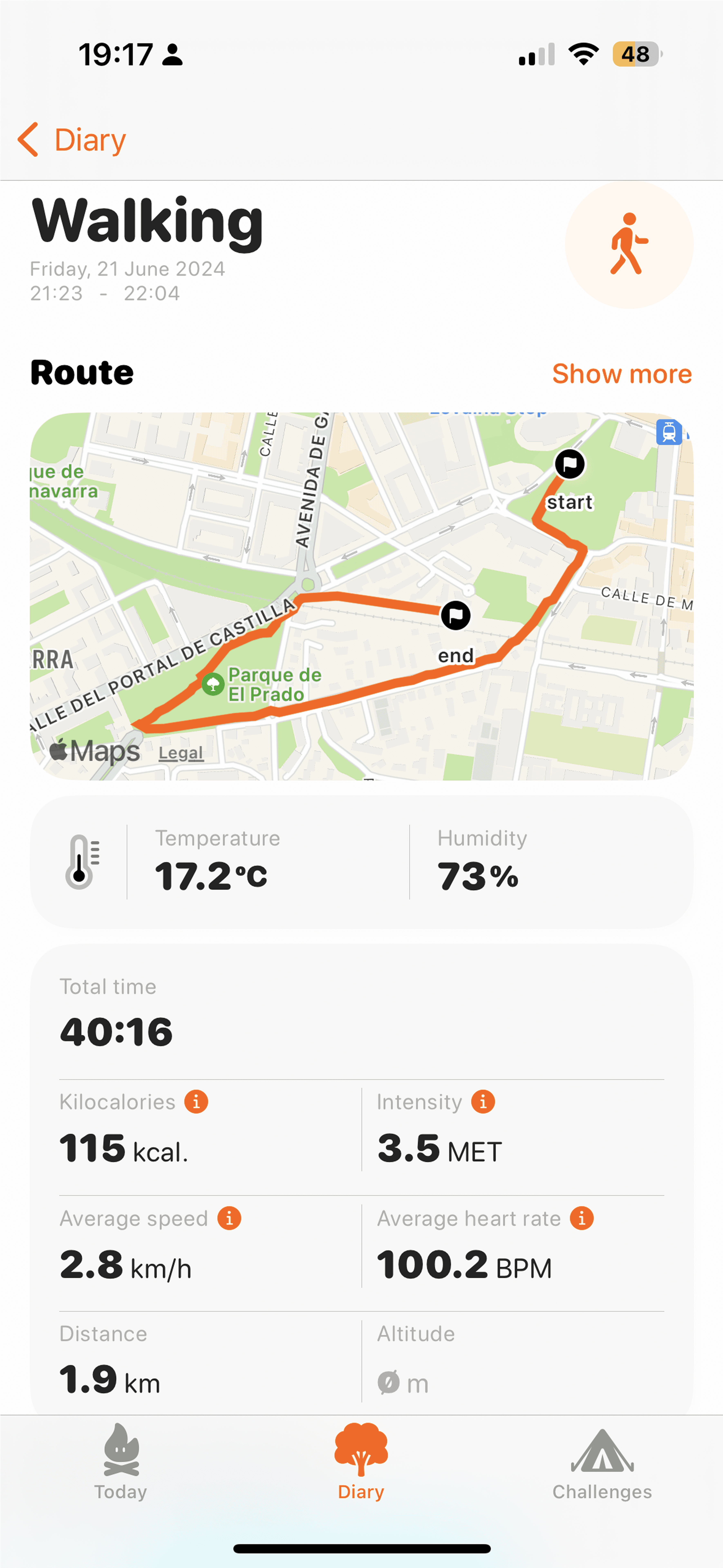
Workout views focused on basic stats like distance, calories, and heart rate. Routes were displayed, but insights into performance or context over time were limited.




After
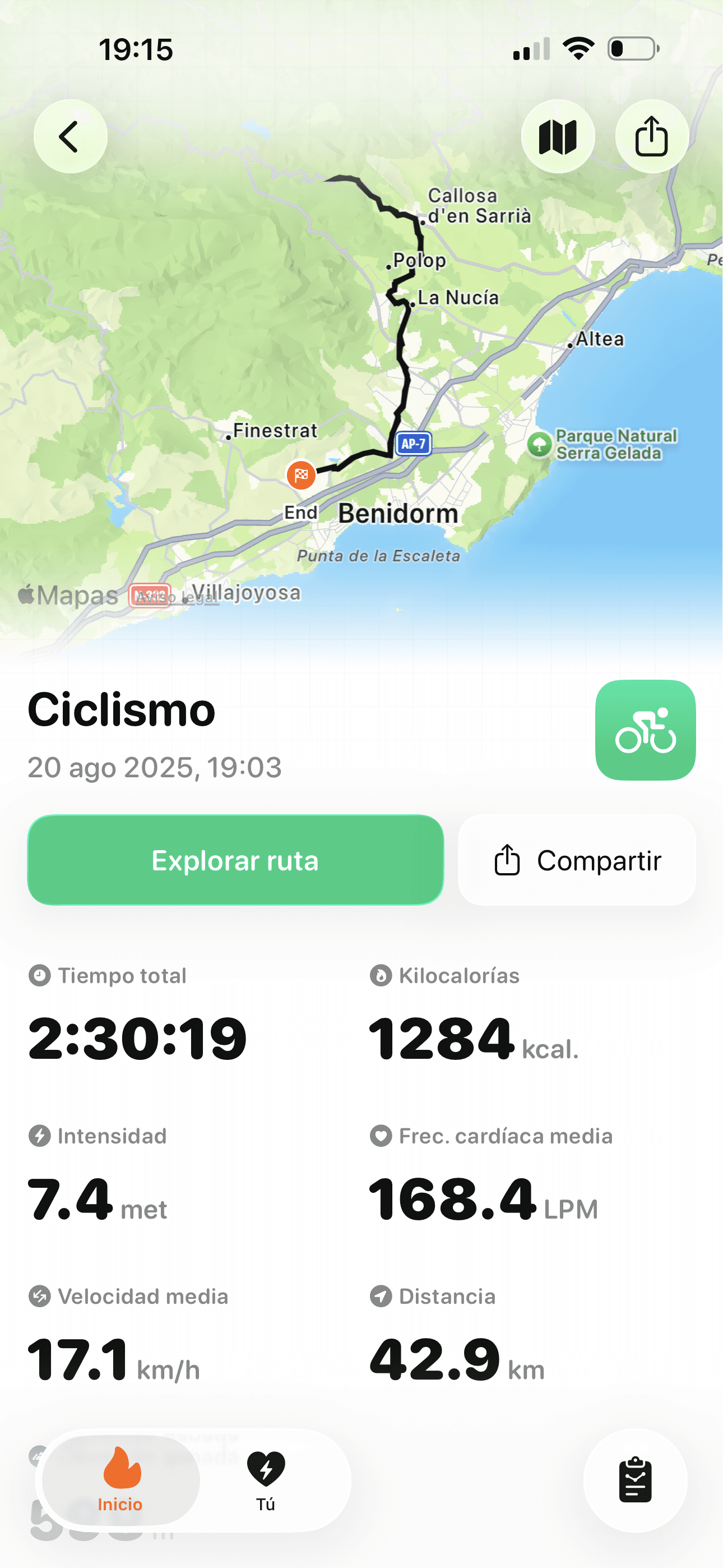
Training analysis now feels more dynamic and immersive thanks to the new Scroll Edge Effect. As you scroll through long workouts, headers and maps blend seamlessly with Liquid Glass surfaces. The layout highlights performance trends, intensity, and recovery impact, making it easier to explore your sessions without losing context.




Before
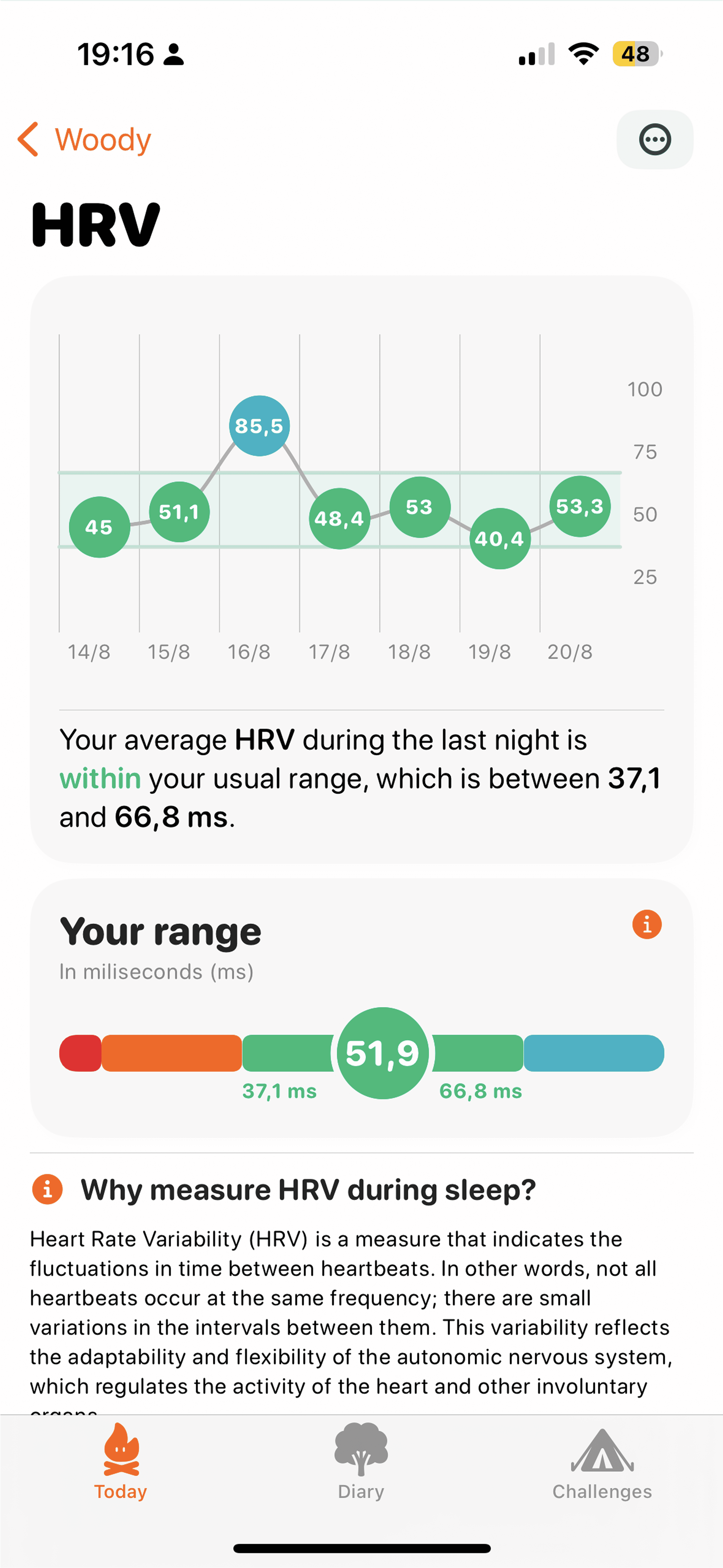
Workout views focused on basic stats like distance, calories, and heart rate. Routes were displayed, but insights into performance or context over time were limited.




After
Training analysis now feels more dynamic and immersive thanks to the new Scroll Edge Effect. As you scroll through long workouts, headers and maps blend seamlessly with Liquid Glass surfaces. The layout highlights performance trends, intensity, and recovery impact, making it easier to explore your sessions without losing context.




Before
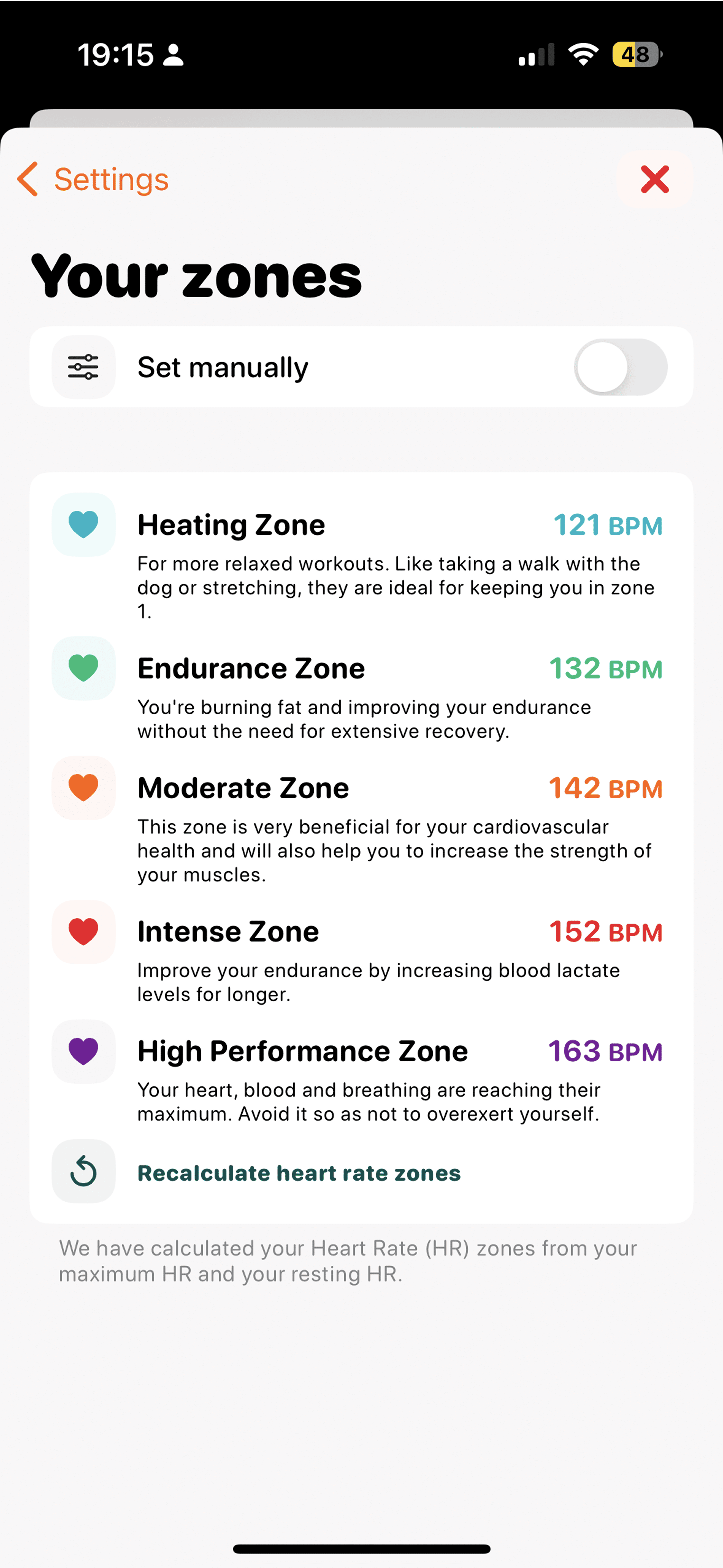
Heart rate zones were shown in a static list, with generic values and little interaction. The view felt rigid and separate from the rest of the app experience.




After
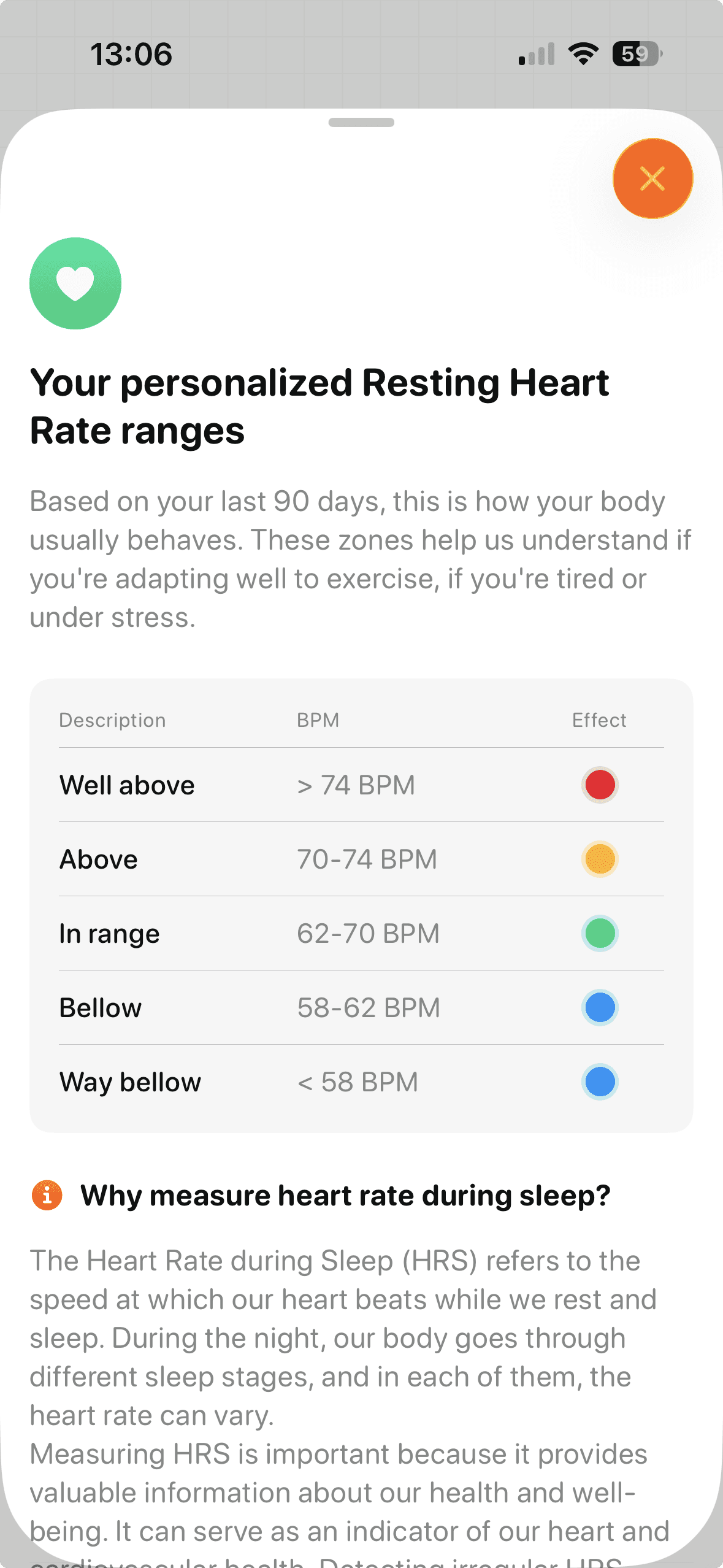
The settings screen was a static list of options, functional but impersonal. Navigation felt crowded, and the design didn’t reflect the rest of the app’s warmth.




After
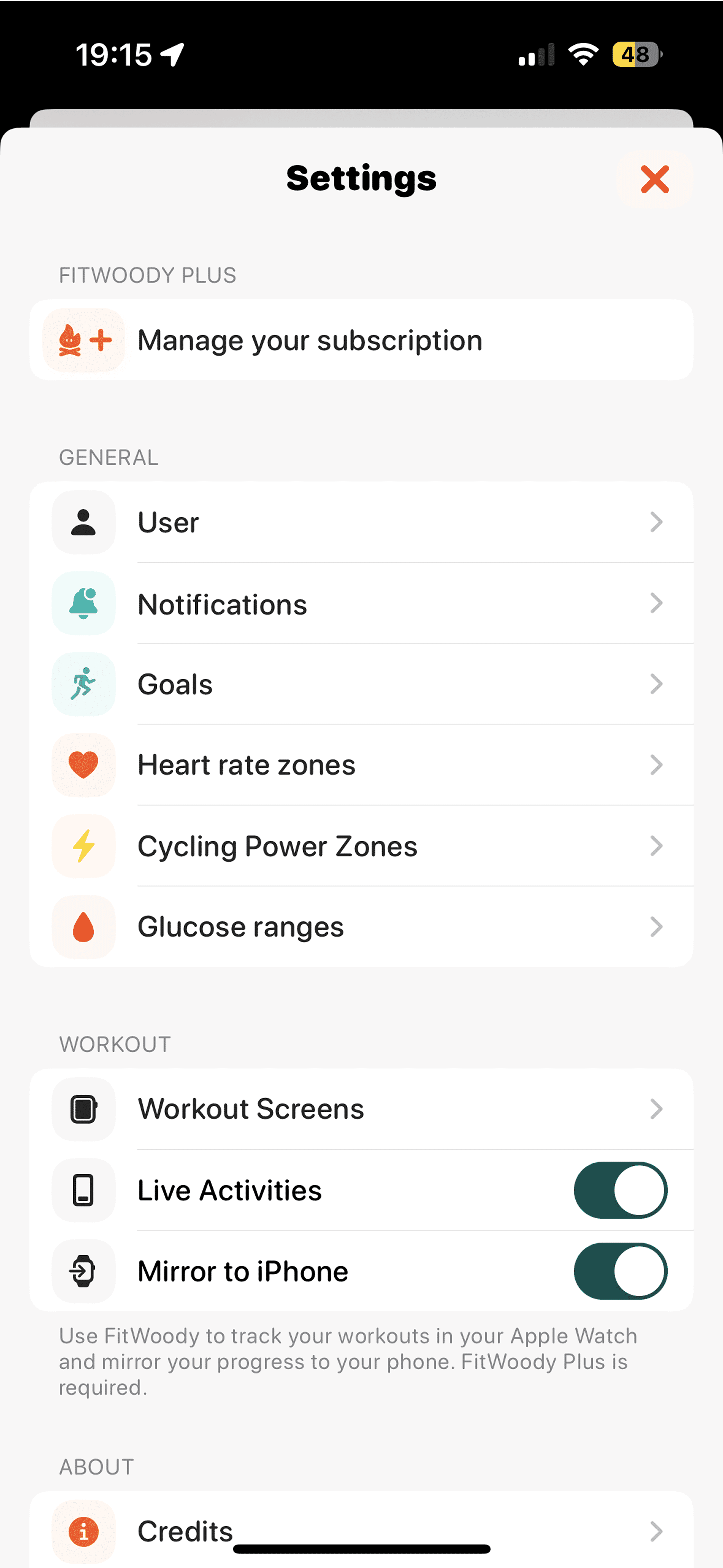
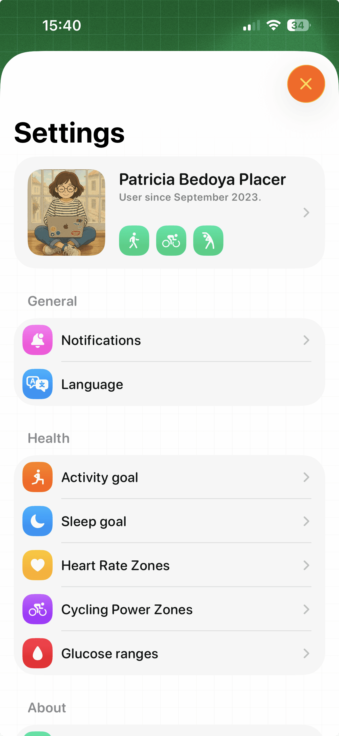
The new Settings screen introduces a more personal touch, starting with your profile at the top and a clearer structure for goals and health metrics. Combined with Liquid Glass surfaces and smoother transitions, it feels lighter, easier to navigate, and more consistent with the overall design.


Before
Heart rate zones were shown in a static list, with generic values and little interaction. The view felt rigid and separate from the rest of the app experience.


After
The settings screen was a static list of options, functional but impersonal. Navigation felt crowded, and the design didn’t reflect the rest of the app’s warmth.


After
The new icon embraces Apple’s Liquid Glass aesthetic, with translucent layers, depth, and light reflections. It keeps the friendly campfire spirit of FitWoody, but reimagined with modern textures and vibrant gradients, making it feel alive on iPhone, iPad, and Apple Watch.


Before
The tab bar used a flat design with static sections and no adaptation to scrolling. Navigation felt heavier, with multiple steps to access key metrics.

After
The new tab bar minimizes on scroll, adds a dedicated search tab, and uses Liquid Glass effects. Navigation is faster and lighter, keeping the focus on your health data while reducing visual clutter.

Before
Sleep stages were displayed in a flat view with limited context. Data was accurate but felt disconnected, making it harder to understand recovery quality at a glance.

After
A darker Liquid Glass design that highlights each sleep stage with clear contrasts and a timeline view. The redesigned layout emphasizes recovery quality and links sleep directly to daily readiness, making the data easier to interpret and more actionable.

Before
Workout views focused on basic stats like distance, calories, and heart rate. Routes were displayed, but insights into performance or context over time were limited.

After
Training analysis now feels more dynamic and immersive thanks to the new Scroll Edge Effect. As you scroll through long workouts, headers and maps blend seamlessly with Liquid Glass surfaces. The layout highlights performance trends, intensity, and recovery impact, making it easier to explore your sessions without losing context.

Before
HRV data was presented in simple charts, with technical explanations that felt heavy and sometimes hard to translate into daily action.

After
A redesigned metabolic analysis that combines clearer visual ranges with personalized insights powered by Foundation Models. Instead of just numbers, FitWoody now explains trends in plain language and links them directly to your recovery and training goals — all within the new Liquid Glass design with scrollable context.

Before
Heart rate zones were shown in a static list, with generic values and little interaction. The view felt rigid and separate from the rest of the app experience.

After
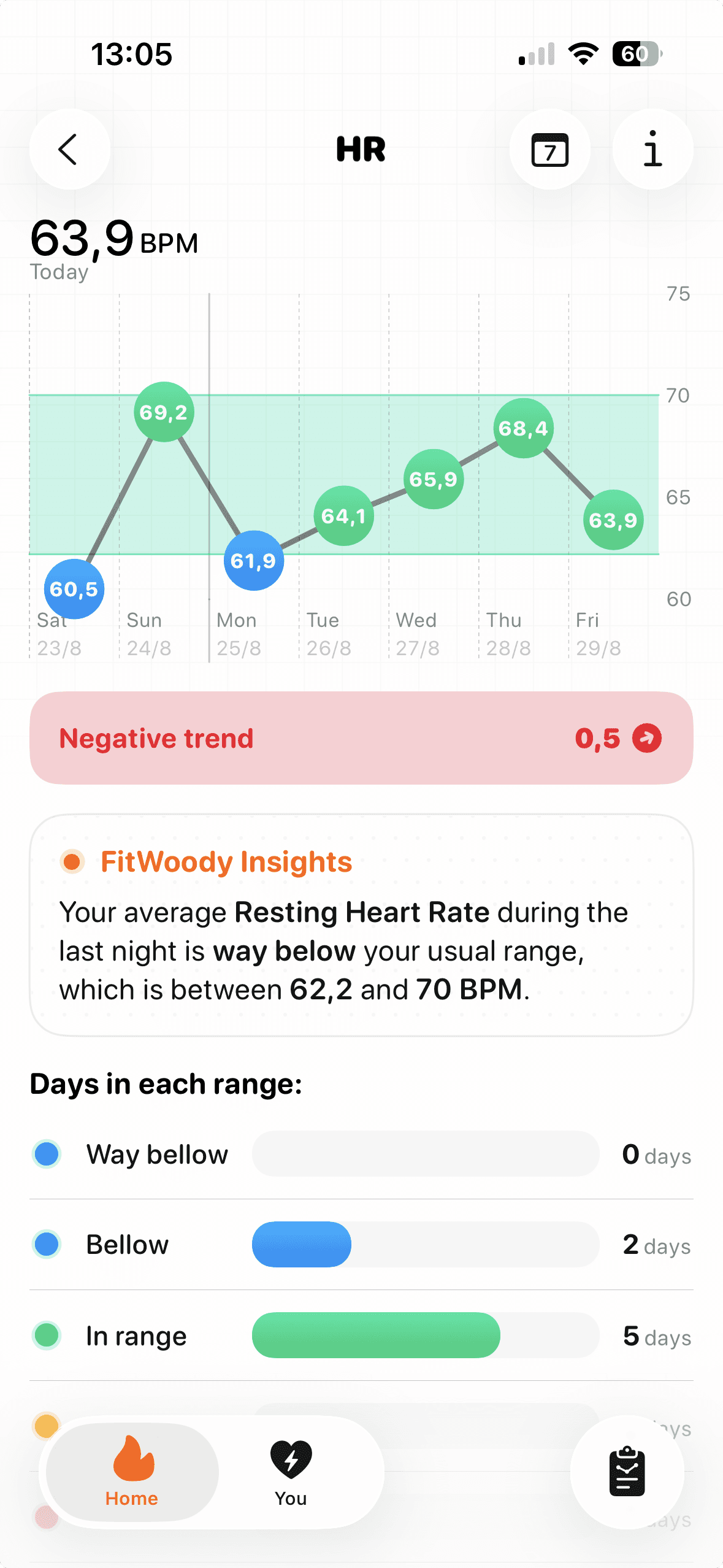
The new Bottom Sheets use Liquid Glass and smooth transitions to display personalized heart rate ranges. Instead of a fixed list, sheets adapt dynamically, showing insights, explanations, and ranges in context. This makes the information easier to read, more interactive, and seamlessly integrated with the rest of the app.

Before
The settings screen was a static list of options, functional but impersonal. Navigation felt crowded, and the design didn’t reflect the rest of the app’s warmth.

After
The new Settings screen introduces a more personal touch, starting with your profile at the top and a clearer structure for goals and health metrics. Combined with Liquid Glass surfaces and smoother transitions, it feels lighter, easier to navigate, and more consistent with the overall design.

Before
The old icon was flat and minimal, with a simplified campfire symbol on an orange background. It worked, but lacked depth and didn’t fully connect with the new iOS 26 design language.

After
The new icon embraces Apple’s Liquid Glass aesthetic, with translucent layers, depth, and light reflections. It keeps the friendly campfire spirit of FitWoody, but reimagined with modern textures and vibrant gradients, making it feel alive on iPhone, iPad, and Apple Watch.


Icons
FitWoody 2.0 also introduces alternative icons, each reimagining the campfire spirit in a different mood. The classic green version reflects our new identity, the dark ember theme brings an intense, night-mode energy, and the lilac translucent flame embraces the Liquid Glass aesthetic to its fullest.
Foundation Models
FitWoody uses Foundation Models to turn complex health and fitness data into plain-language insights. From workouts to sleep to recovery, the app automatically generates summaries that adapt to your current condition and progress, so every user gets guidance that feels clear, human, and personal.
The Foundation Models generate a message that updates throughout the day, together with the color of the Home screen. Both adapt to your sleep, recovery, and activity, giving you instant context about how you’re doing and what matters most right now, whether it’s pushing harder, slowing down, or focusing on recovery.
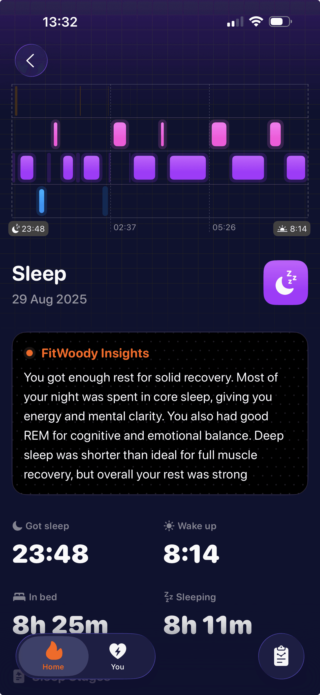

Sleep Insights
FitWoody uses Foundation Models to analyze your sleep stages and translate them into plain language. Instead of just showing REM, core, and deep sleep, the app explains what those patterns mean for your recovery, energy, and readiness. Every morning you get a short summary that helps you understand how last night’s rest will impact your day.

Training Insights
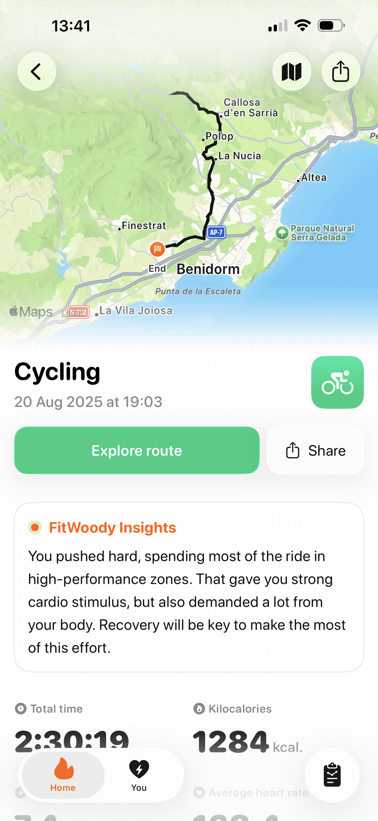
Training analysis now feels more dynamic and immersive thanks to the new Scroll Edge Effect. As you scroll through long workouts, headers and maps blend seamlessly with Liquid Glass surfaces. The layout highlights performance trends, intensity, and recovery impact, making it easier to explore your sessions without losing context.

Cardio Report
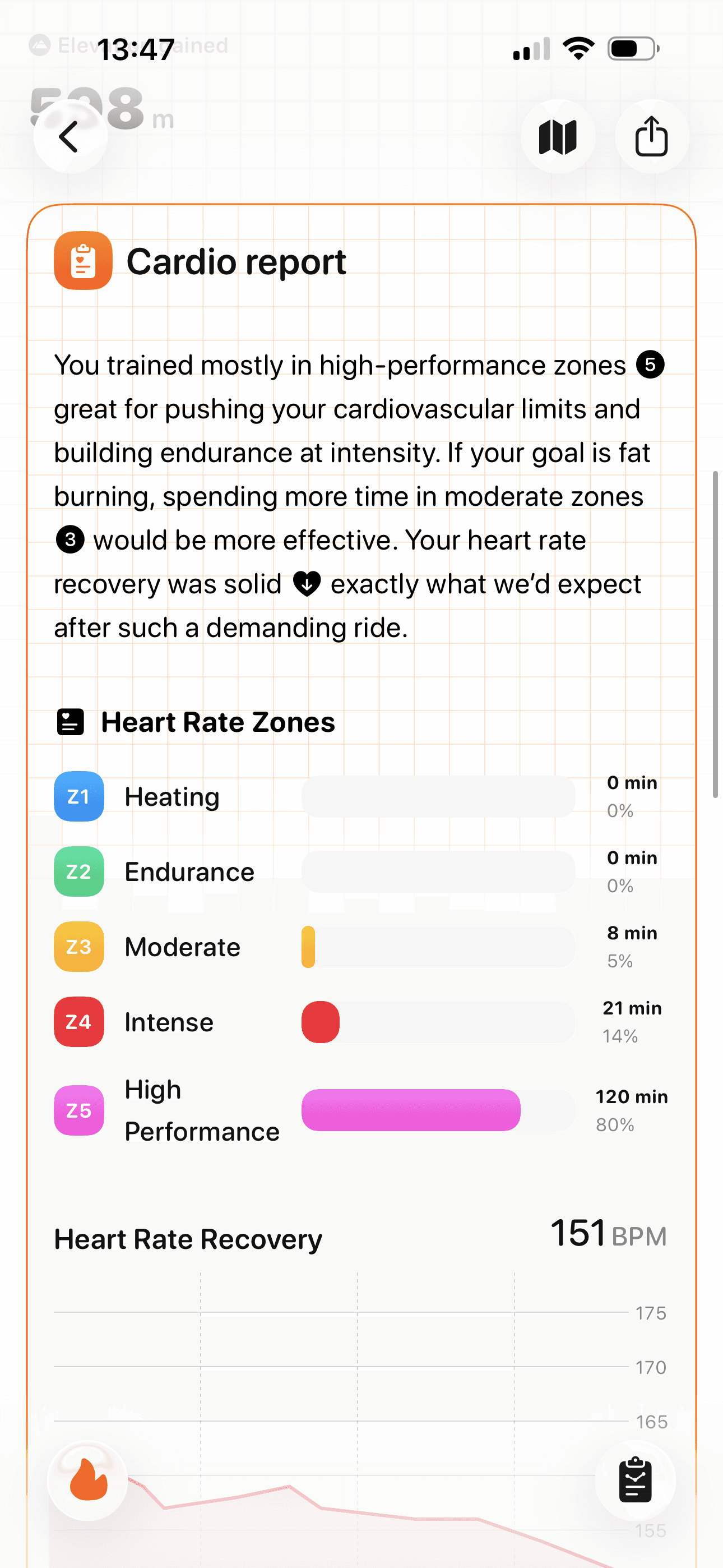
FitWoody uses Foundation Models to break down your heart rate zones after each workout and explain what they mean. Instead of just listing time spent in each zone, the app highlights whether you trained for endurance, fat burning, or performance, and evaluates how well your heart recovered. This makes cardio data easier to understand and directly actionable.

Sleep Insights
FitWoody uses Foundation Models to analyze your sleep stages and translate them into plain language. Instead of just showing REM, core, and deep sleep, the app explains what those patterns mean for your recovery, energy, and readiness. Every morning you get a short summary that helps you understand how last night’s rest will impact your day.
Training Insights
FitWoody uses Foundation Models to generate a summary of each workout, going beyond raw stats. The app explains how hard you pushed, which zones you trained in, and what that means for your body. Instead of just numbers, you get context, whether you need more recovery, if you’re progressing, or if you may be overreaching.


Cardio Report
FitWoody uses Foundation Models to break down your heart rate zones after each workout and explain what they mean. Instead of just listing time spent in each zone, the app highlights whether you trained for endurance, fat burning, or performance, and evaluates how well your heart recovered. This makes cardio data easier to understand and directly actionable.

Try FitWoody 2.0 before anyone else
Build habits that last, even on tough days. Understand your energy. Adapt to your mood.
Supported by
© 2026 Chubby Studio. All rights reserved.
·
·
·
·
·

Try FitWoody 2.0 before anyone else
Build habits that last, even on tough days. Understand your energy. Adapt to your mood.
Supported by
© 2026 Chubby Studio. All rights reserved.
·
·
·
·
·

Try FitWoody 2.0 before anyone else
Build habits that last, even on tough days. Understand your energy. Adapt to your mood.
Supported by
© 2026 Chubby Studio. All rights reserved.
·
·
·
·


