


Who gets to understand their own body? : FitWoody Accesibility Commitment
2.4.3

Before the first chart. Before the first metric. Before any line of code.
There was a question we couldn't stop asking ourselves:
Who gets to understand their own body?
Not who has the best watch. Not who reads the most papers. Not who can interpret a heart rate variability graph without help.
Everyone.
That question has quietly shaped every decision we've made since FitWoody's first sketch. And today, we want to talk about all of it. What we added this month, and everything we've been building into FitWoody since day one.
The invisible wall
Health data has a problem most apps don't talk about. It's visual. Deeply, stubbornly visual. Charts. Colors. Gradients that shift from green to red to tell you how you slept. Tiny numbers tucked into corners. Graphs that reward pattern recognition.
If you can see them, they feel intuitive. If you can't, they feel like a locked door.
And here's what bothered us most: the data behind those charts belongs to you. Your heart rate. Your sleep. Your recovery. Your body's quiet signals about what it needs today. Locking that behind a visual interface isn't just a design limitation. It's an exclusion.
We couldn't accept that.
Charts you can listen to
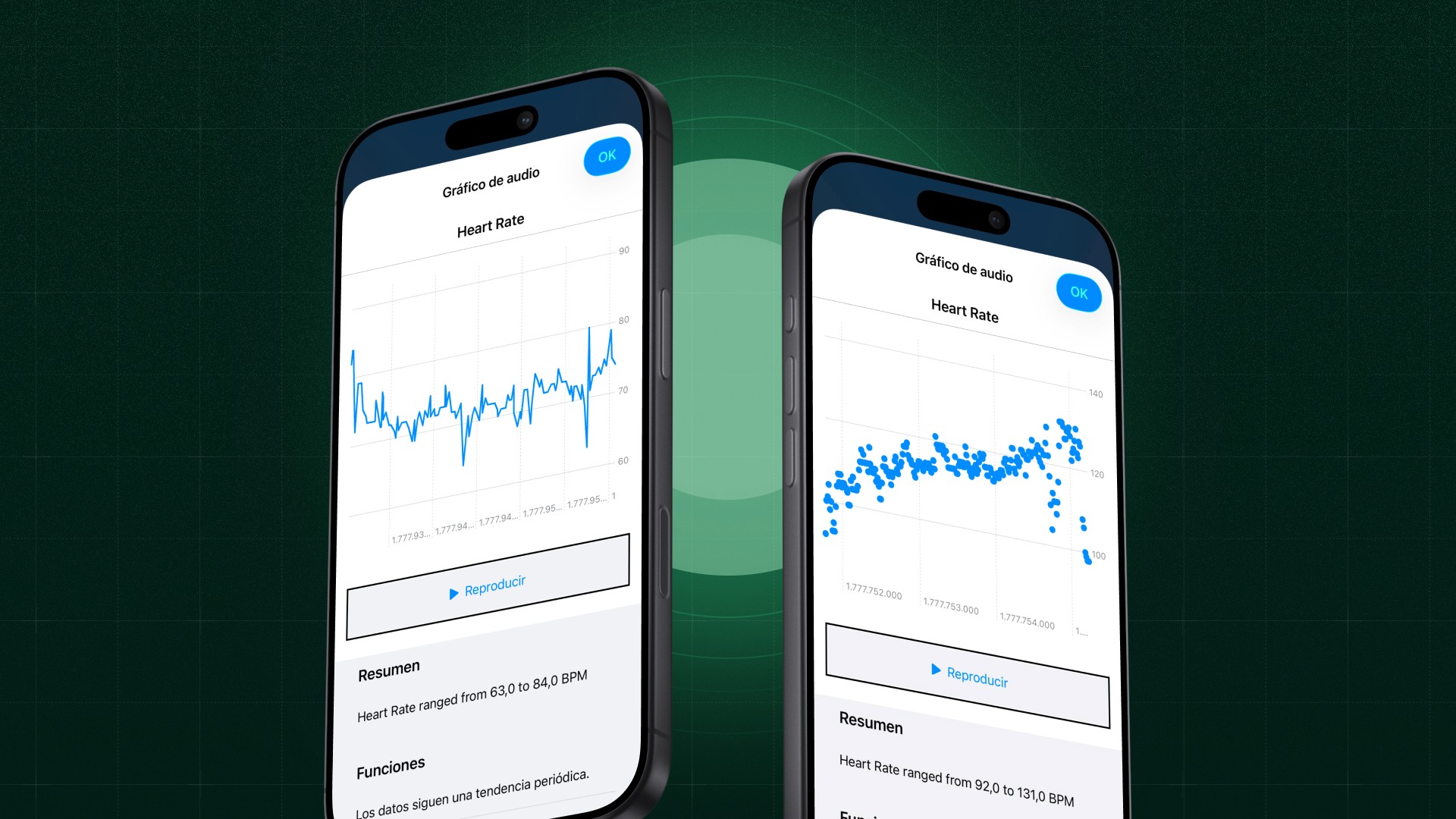
Starting this month, every chart in FitWoody speaks.
Sleep score trends. Heart rate zones. Training load. Metabolic analysis. Recovery arcs. Activity targets. Every graph across the app now supports Audio Graphs through VoiceOver.
What does that mean in practice? It means a VoiceOver user can place their finger on a sleep score chart and hear the week. A rising tone for the nights that went well. A dip for the ones that didn't. The same shape, the same story, the same insight that a sighted user gets from looking at a line going up or down.
We built a reusable system that understands three types of data: time series (your sleep score over a week), categorical (your heart rate zone distribution), and multi series (deep sleep and REM overlaid together). Each one generates its own audio landscape, with natural language summaries that describe what the data actually means.
This isn't a compliance feature. It's a new way to experience your health.
Reduce Motion
Not every body processes movement the same way.
For users with vestibular sensitivity, motion disorders, or simply a preference for stillness, screen animations can range from mildly distracting to physically uncomfortable. Parallax effects, sliding transitions, bouncing elements: things most users never notice can make an app unusable for others.
FitWoody now fully respects the Reduce Motion system preference. When it's enabled, our animated gradients freeze into static versions. The colors stay. The information stays. The experience stays. The motion goes.
Calm shouldn't be an afterthought in a wellness app. It should be the default.
The small details that change an experience
Along with Audio Graphs and Reduce Motion, this release carries a handful of fixes that sound minor on paper and matter enormously in practice.
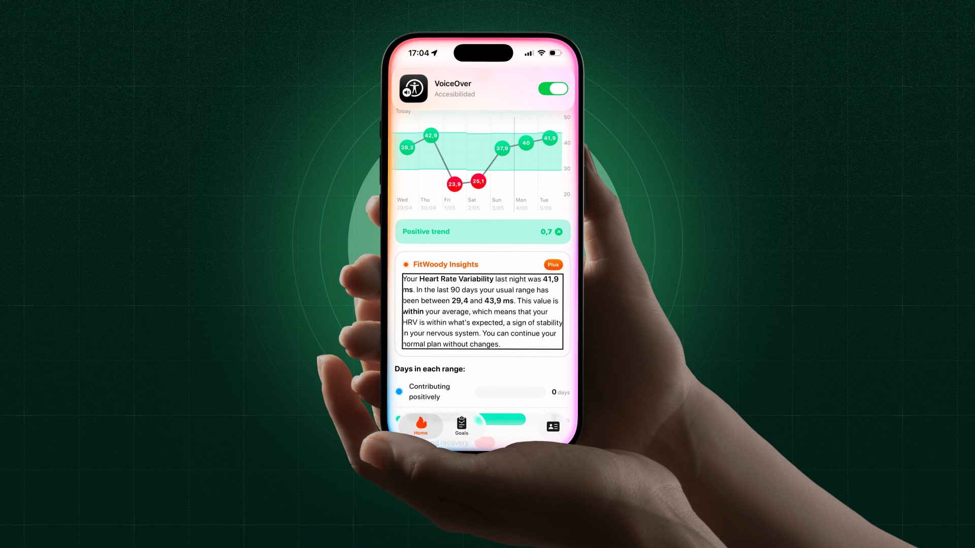
Our sleep score chips now read aloud as "Sleep score 89, Very Good" instead of just "89." The category travels with the number, because the number alone doesn't tell you anything. Duration chips do the same: "9h 20min, Above goal." Settings pickers announce their purpose. Buttons scale their icons with Dynamic Type so nothing gets stuck at a fixed size when you need text bigger.
None of these changes will show up in a screenshot. All of them will show up in someone's day.
Designed to be understood
We rarely talk about this publicly, but cognitive accessibility has been one of our strongest design principles from day one.
Health apps have a tendency to overwhelm. Dashboards packed with twelve metrics. Screens that demand you cross-reference three charts to understand a single insight. Data presented as if the user has a degree in sports science.
FitWoody was designed the opposite way. One clear insight per screen. Linear, predictable navigation. The most important thing about today, right now, at the top. Deeper data available when you want it, invisible when you don't.
This isn't simplification for the sake of aesthetics. It's a deliberate choice for people with cognitive disabilities, attention challenges, learning differences, or anyone who just had a long day and wants to know if they slept well without decoding a dashboard.
Understanding your body should never require a manual.
A language beyond color
Color is the easiest way to communicate quality. Green means good. Red means bad. Yellow means somewhere in between.
Unless you're one of the millions of people worldwide who see color differently.
Before we chose a single color for FitWoody, we ran an extensive study across the full spectrum of color vision conditions: protanopia and protanomaly (reduced red sensitivity), deuteranopia and deuteranomaly (reduced green sensitivity), tritanopia and tritanomaly (reduced blue yellow sensitivity), and achromatopsia (complete absence of color perception).
Every color combination was tested for contrast ratios in both light and dark mode. But more importantly, we built a rule that we never break: no piece of information in FitWoody depends solely on color.
Shapes. Text labels. Patterns. Icons. There's always a second channel. Always a way to understand what the data means without relying on hue alone.
We call this "Differentiate Without Color." It's not a feature you'll notice if color works fine for you. But for someone who needs it, it's the difference between using an app and being used by one.
VoiceOver: depth, not decoration
Supporting VoiceOver isn't something you do at the end. It's something you build into every component.
When a VoiceOver user lands on a sleep score chip, they don't just hear a number. They hear the number, the category, the context, the meaning. When they reach the effort bar chart after a workout, they don't get stuck on a visual only slider. They get an adjustable action: swipe up or down to set perceived effort from 1 to 10. Accessible. Interactive. Functional.
Across the app, we've hidden decorative elements from VoiceOver: background chart marks, navigation chevrons, layout only icons. Things that exist to make the app look beautiful for sighted users, but would only create noise for someone navigating by ear. Every icon only button carries a semantic label that describes what it does, not what it looks like.
This is the work that doesn't show up in screenshots. But it shows up in someone's experience every single day.
Dynamic Type, everywhere
Your preferred text size is a personal choice. FitWoody respects it across the entire app.
We use semantic font styles throughout: caption, body, headline, title. No hardcoded sizes. No fixed layouts that break when someone needs larger text. Minimum scale factors prevent truncation, and widgets adapt their content to your Dynamic Type range.
If you need text to be bigger, it gets bigger. Everywhere. Without breaking anything.
Dark Mode, with intention
Dark Mode in FitWoody isn't an inverted version of light mode. It's a carefully tuned experience with its own contrast ratios, its own hierarchy, its own moments of emphasis.
Every surface, every text color, every chart element was tested for sufficient contrast in both appearances. Because accessibility isn't a mode you switch on. It's a standard you maintain, regardless of how the screen looks.
AI that speaks plainly
Health data is complex. The language around it doesn't have to be.
FitWoody uses Apple Intelligence to generate daily summaries that translate your metrics into something a human would actually say. Not "Your HRV standard deviation decreased relative to your 7 day rolling baseline." Instead: "Your body is still recovering from yesterday. Today might be a good day to take it easy."
This matters for everyone. But it matters especially for users who find medical or technical language difficult to parse. Clear language is an accessibility feature.
Numbers that read correctly
A small detail that makes a real difference: every number in FitWoody is formatted so that VoiceOver reads it naturally.
Percentages, durations, scores. Not "zero point eight five" for 85%. Not "nine colon twenty" for 9 hours and 20 minutes. The right words, in the right order, every time.
This is not a finished story
Accessibility is not a destination. It's a practice.
Some of what we've talked about here shipped this month: Audio Graphs, Reduce Motion, chip labels that carry their meaning, pickers that announce their purpose, buttons that respect your text size. Some of it has been there since the beginning: the color study, cognitive simplicity, deep VoiceOver integration, Dynamic Type, Dark Mode, plain language AI, accessible number formatting.
We wanted to talk about all of it at once, because accessibility isn't a feature you ship. It's a posture you hold.
Every update is a chance to ask that same question again: who gets to understand their own body?
Our answer hasn't changed. Everyone.